- Print
- DarkLight
- PDF
Planning the course layout is key to a successful Ultra course. A well-planned course layout is essential for a successful Ultra course. A clear and logical structure helps students find relevant information quickly and makes course management easier for lecturers.
Organising content
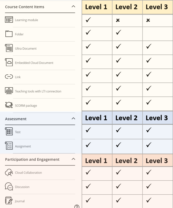
clickUP Ultra allows you to organise your course into three levels.
The table below shows the content, assessments, and participation items available within each level.

Planning document
Use this Planning Document that was developed by the clickUP Ultra training team.
Feedback from Pioneer lecturers during the First Phase Implementation indicated that this planning document was highly beneficial.
Learning Module or Folder?
| Learning Module | Folder |
|---|---|
| Structured learning path | Unstructured content |
| Easy navigation with forward and backward button between pages | Each item opens in a new layer on top of others, requiring you to close it with an X. |
| Allows adding images | Does not allow adding images |
| Can be copied from past courses as a block of materials | Can be copied from past courses as a block of materials |
The structure of your module should be based on factors like the number of units, themes, and weeks included. Consider the amount of scrolling needed and choose between these two approaches:
Single Learning Module with Folders Inside
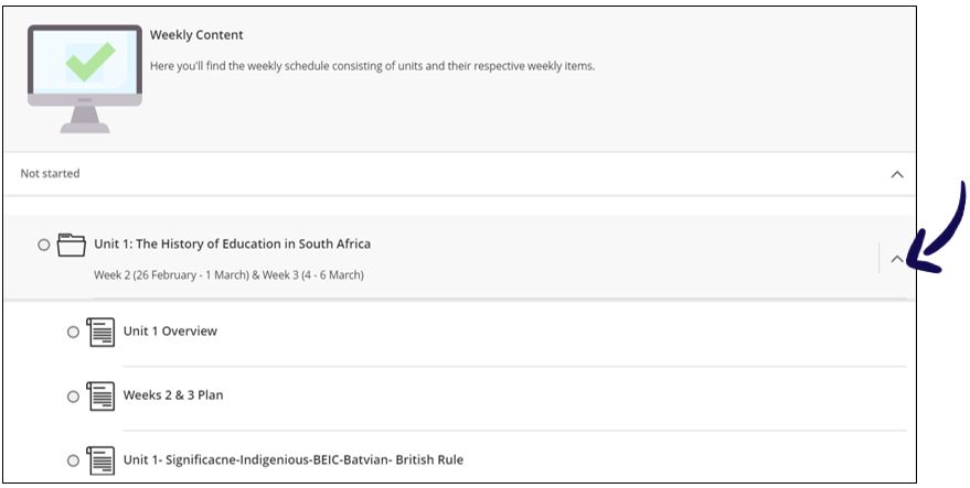
This option places all content within one learning module, organised into folders for each unit or theme. Students can expand and collapse these folders as needed.
Separate Learning Modules for Each Unit/Theme/Week
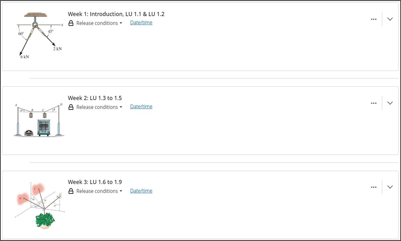
Alternatively, you can create individual learning modules for each unit, theme, or week. If you choose this method for a course with 14 weeks, we recommend moving the current week to the top regularly to help students easily access the latest content.
When deciding between Folders and Learning Modules, prioritise the student experience. Minimise scrolling and ensure that the content is logically organised and aligned with the Study Guide.
Note: Using a folder at the top level can disadvantage students by removing navigation arrows and requiring more clicks than a learning module, which may lead to frustration.
.png)


