System Navigation Changes:
Why the change?
Focused improvements to address common usability challenges, based on user feedback, necessitated these changes to make clickUP more intuitive.
- Better use of screen space: The new layout avoids stacked panels that previously reduced content visibility.
- Fewer navigation errors: The “Exit (X)” button was prone to accidental clicks; removing the prominent X to leave a course means users will need to action an exit, rather than accidentally clicking the X.
- Improved performance: Changing from panels to pages aims to load content faster, as it removes the layering of panels.
- Clearer context: Simplified URLs and layout help users stay oriented to where they are in the course.
- Reduced motion issues: Removing panels and going to a full-page view means less layering of panels that promotes a more seamless navigation experience.
What is changing?
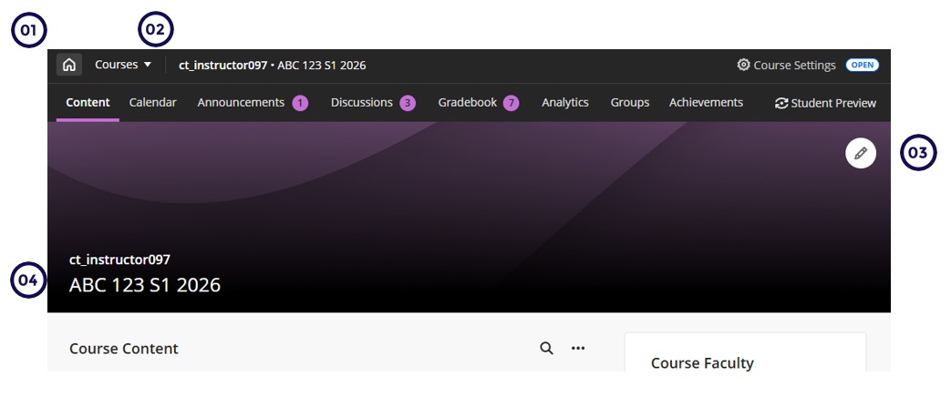
Course panels display as a full-screen page:
Courses now open in full-screen mode, maximizing horizontal space and reducing visual clutter.

- Home button replaces X - The traditional “X” to exit is now a Home button. This prevents accidentally closing the course.
- Course Switcher - A new Course Switcher provides streamlined navigation between courses, enabling users to quickly switch between courses.
- Full-Width Banner - The course banner spans the full width of the screen.
- Course Title and ID on the Banner - The course ID and title are now overlaid on the banner, freeing up vertical space and improving contextual clarity.